Grid
The Material Design layout grid is made up of three elements: columns, gutters, and margins.
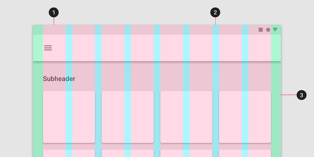
1) Columns 2) Gutters 3) Margins
Read more in Material specification.
Breakpoint
Material Design provides responsive layouts based on the following column structures. Layouts using 4-column, 8-column, and 12-column grids are available for use across different screens, devices, and orientations.
Each breakpoint range determines the number of columns, and recommended margins and gutters, for each display size.
Qaterial define 5 breakpoints:
| Breakpoint Range | Attached Property | Columns | Margins/Gutters |
|---|---|---|---|
| 0 - 359 | Qaterial.Layout.extraSmall |
4 | 8 |
| 360 - 599 | Qaterial.Layout.small |
4 | 16 |
| 600 - 959 | Qaterial.Layout.medium |
8 | 16 |
| 960 - 1279 | Qaterial.Layout.large |
12 | 24 |
| 1280 - Infinite | Qaterial.Layout.extraLarge |
12 | 24 |
For each element in the Grid, the occupied space taken by the item must be specified. Available values are:
Qaterial.Layout.FillParentQaterial.Layout.FillHalfQaterial.Layout.FillThirdQaterial.Layout.FillQuarterQaterial.Layout.FillSixthQaterial.Layout.FillTwelfth
Grid Behavior
Fluid grids
Fluid grids use columns that scale and resize content. A fluid grid’s layout can use breakpoints to determine if the layout needs to change dramatically.

Fixed grids
Fixed grids use columns of a fixed size, with fluid margins to keep content unchanging within each breakpoint range. A fixed grid’s layout can only.
